TLDR - at the end. But I urge you to read ahead if you'd like to understand the concept.
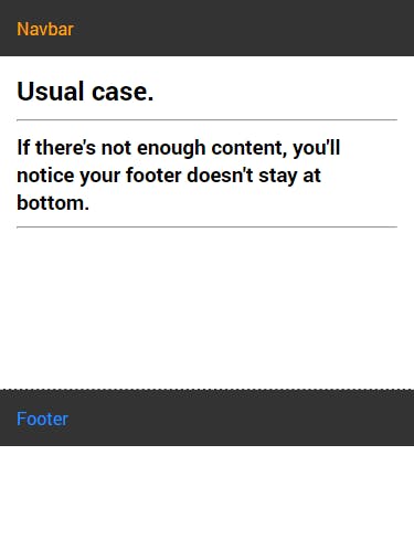
Have you run into this problem where the footer on your site does not stay at the bottom of the page, even if it is the last tag in your HTML body.
Especially if you are new to web development, you'll run into this problem. There are ways of making sure your footer stays at the bottom, but most of those methods have some kind of caveat.
- Position: absolute (doesn't work when there's more content, you'll realize the footer is stuck and your content is scrolling behind it).
- Position: fixed (use only if you want your footer to be always visible).

There's a way using flexbox which works on device of every size, doesn't require a fixed height of navbar or footer, and works without any side-effects.
Reset browser defaults
If you are not using any css frameworks, you should reset some browser default css. Otherwise, your browser will apply its own margin and padding to the page.
  /* following style will be applied to every element */
  *, *::before, *::after{
     margin: 0;
     padding: 0;
     box-sizing: border-box;
  }
  /* write your own css after this part */
Structure of the page
Your html body should follow this kind of structure. You can use < div > instead of < main >.
<body>
  <div class="pagewrap">
    <nav>...</nav>
    <main>...</main>
    <footer>...<footer>
  </div>
</body>
basically wrap all content of your page inside a div, give it some classname
Using flexbox
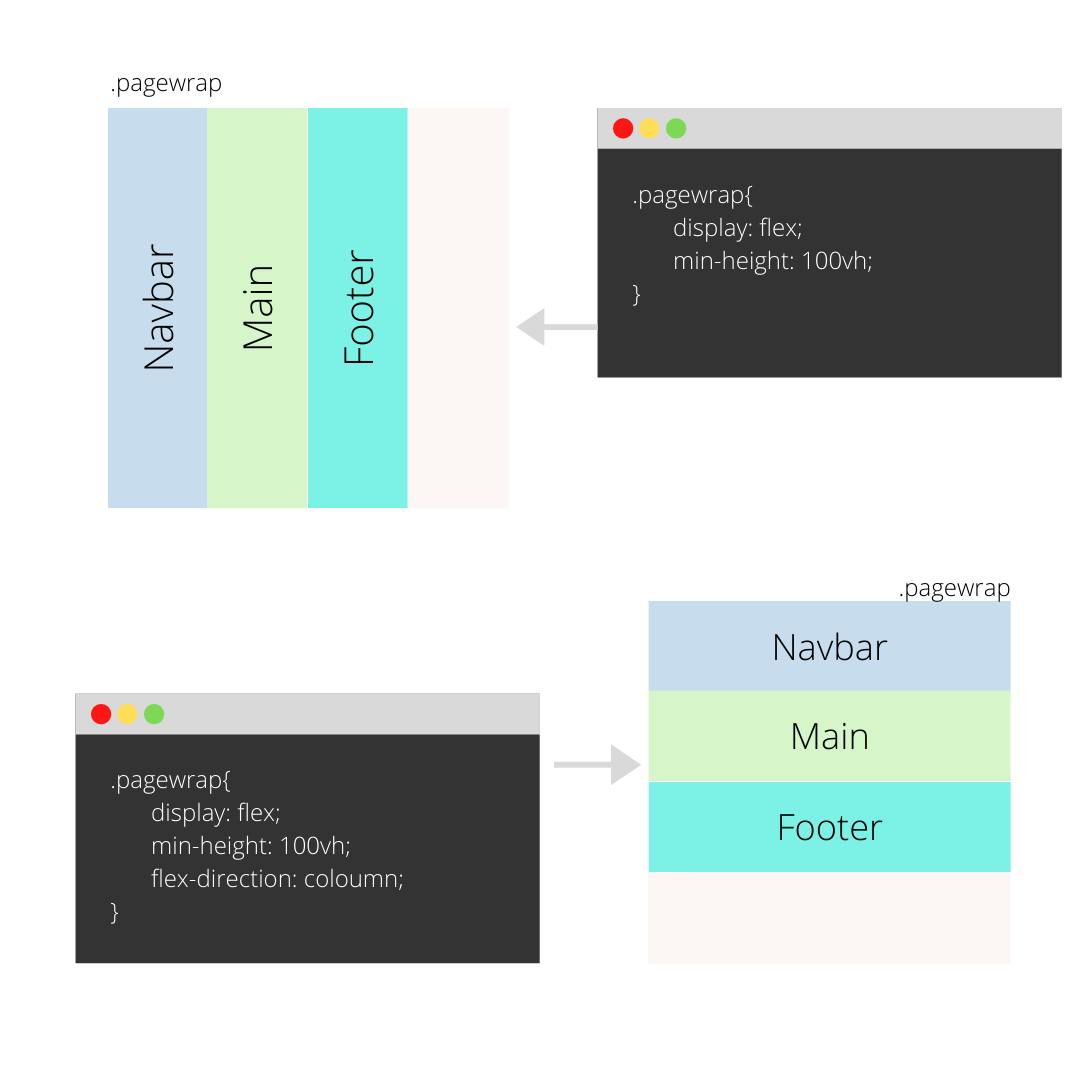
Add display:flex and flex-direction:column to your main div (which contains all other elements of the page). You also need to make that div take full height of the viewport. see below code:
  .pagewrap{
    display: flex;

    /*vertically stack children*/
    flex-direction: column;

    /* expand to take full height of page */
    /* min-height overrides both height & max-height */
    min-height: 100vh;

  }

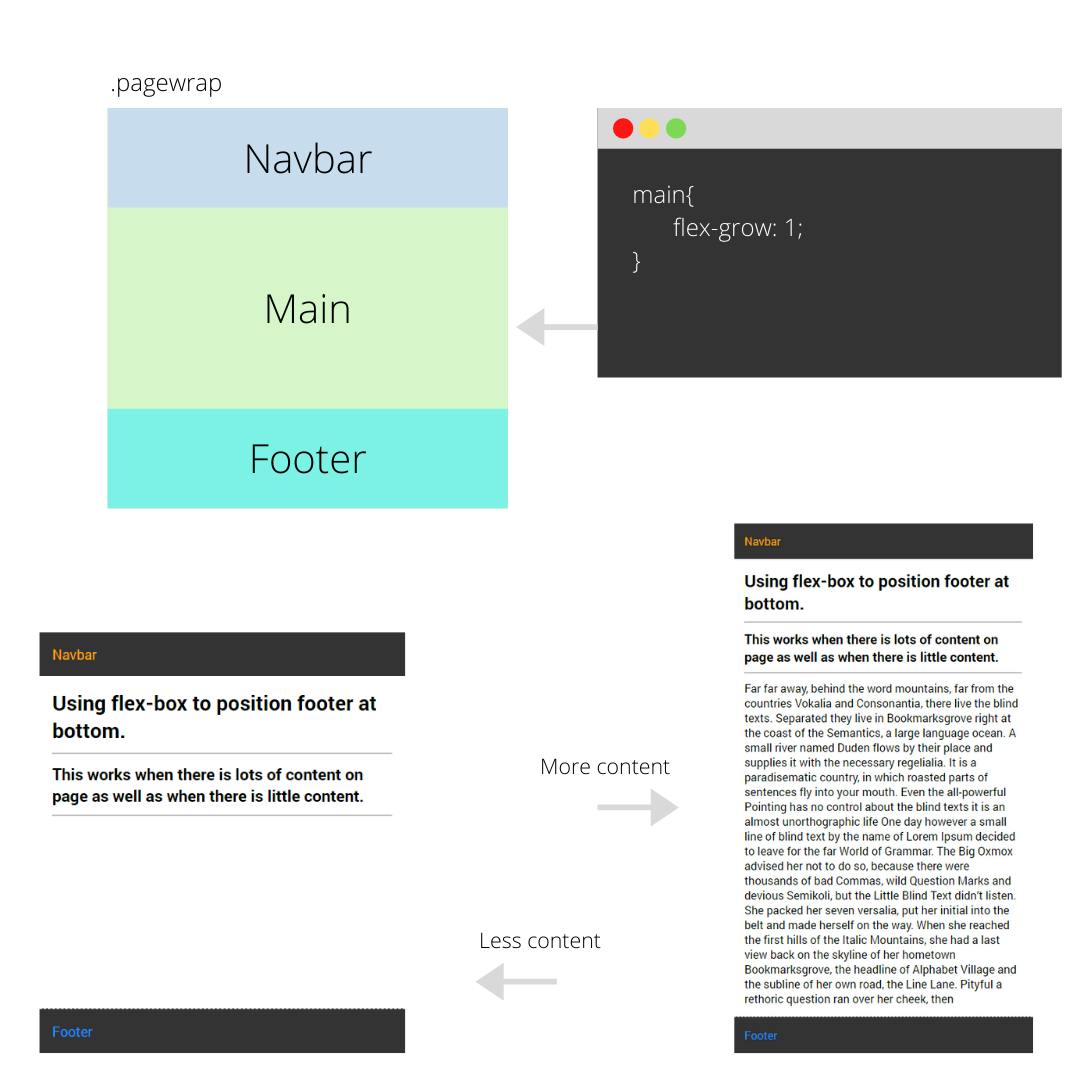
Now all you need to do is stretch the < main > element to take as much height as possible. Use flex-grow to do this.
  main{
    flex-grow: 1;
  }

TLDR :
- Wrap all of your body elements inside a div.
- Give that div a display: flex, flex-direction: column and min-height: 100vh;
- Wrap elements other than navbar and footer inside a div/main tag.
- Give that div/main tag a flex-grow: 1;
That's it! As you can see in the above picture, it works even if you have less content or more content. You don't have to worry about making it responsive.